- Role
- Solo UX/UI Designer
- Timeline
- 2022 – present
- Status
- In TestFlight beta
- Focus
- Research, iOS UI design, usability testing
- Tools
- Figma, Miro, Maze
Overview
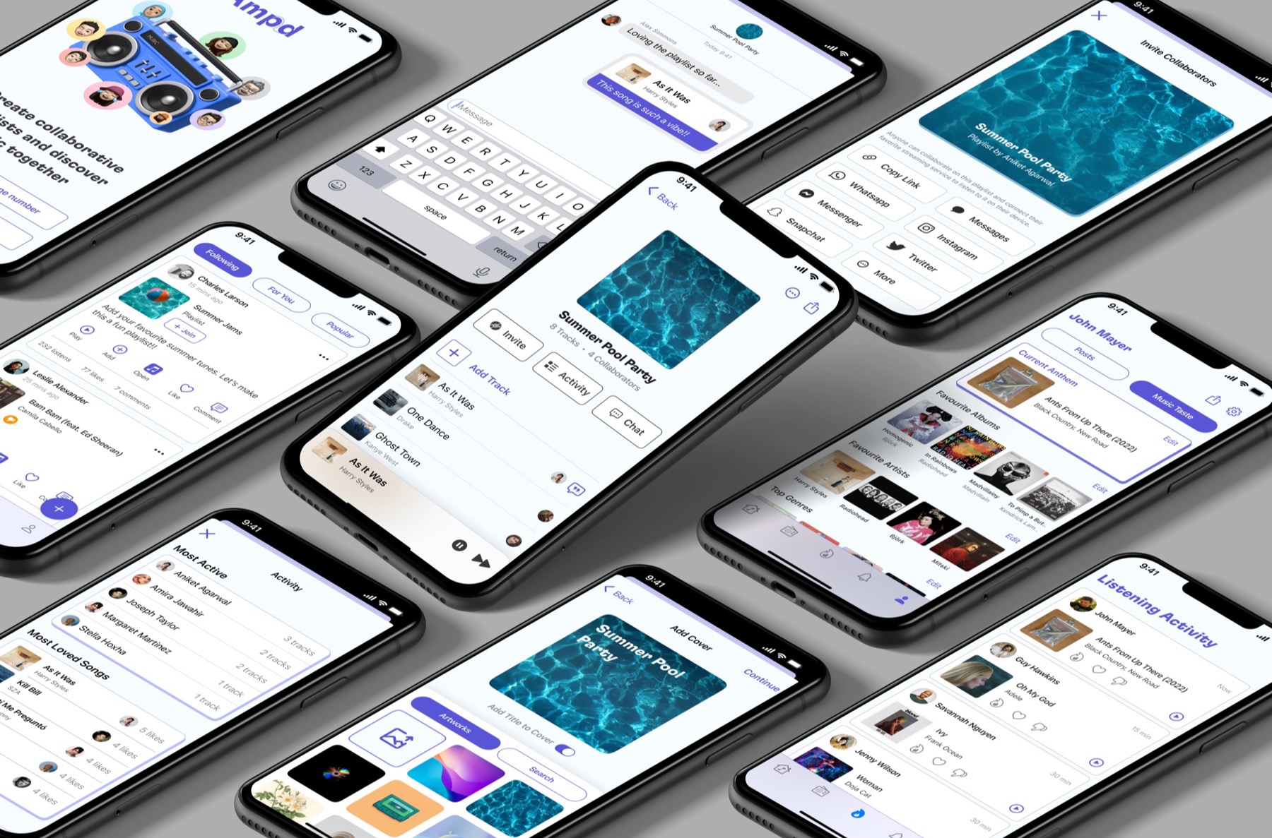
Amp'd is a music app for sharing collaborative playlists, reviews and listening activity with friends. It started as a UX class project and is now in TestFlight beta.
Case study · Personal project · iOS app
Turning solo listening into something you do with friends
Streaming apps are built for one person and one pair of headphones. Amp'd adds the social layer: collaborative playlists, reactions, reviews and a feed. I designed it solo, from the first interview to a usability-tested prototype.
The question
Friends already share what they're listening to, over texts and screenshots. What would it take for that to live inside the music app itself?
My part
All of it. A solo project for a UX design class: research, flows, wireframes, testing and visual design, over three months.
Outcome
All seven testers said they'd use it, and the core tasks averaged 4.6 out of 5 for ease. It's now in TestFlight beta.
01
The gap
Streaming apps are libraries. Friendships aren't.
Every major music app treats listening as a solo act with a follow button bolted on. There's no shared home for a collaborative playlist, no way to leave a note on the song a friend just added, and no feed of what the people you care about are into this week.
This one was personal. I make playlists for friends and want to know what they think, and I do the same for theirs. My hunch was that other people wanted this too. The research was there to find out.
02
Research
I treated a TikTok comment section as a focus group
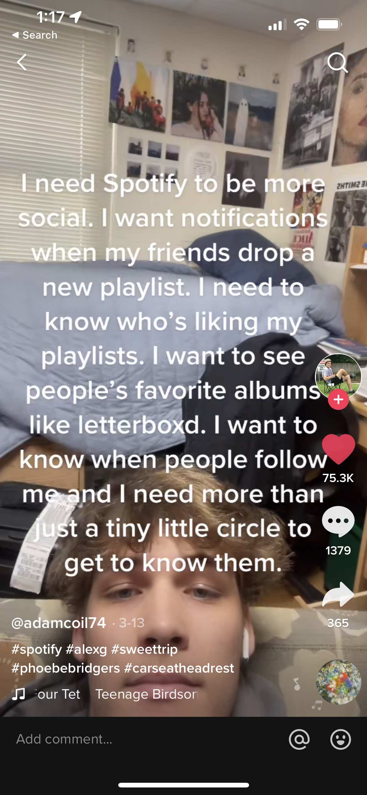
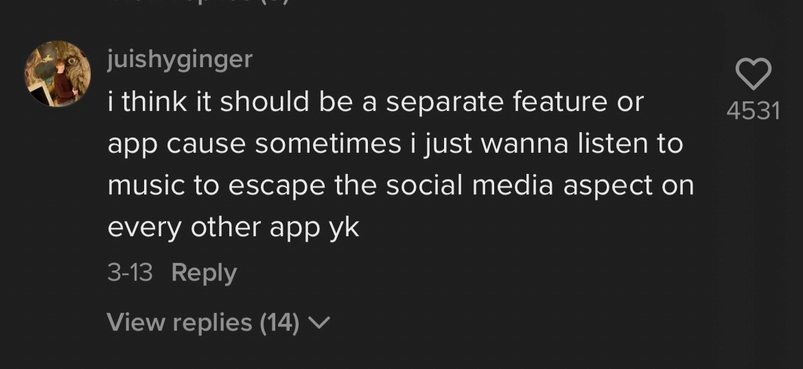
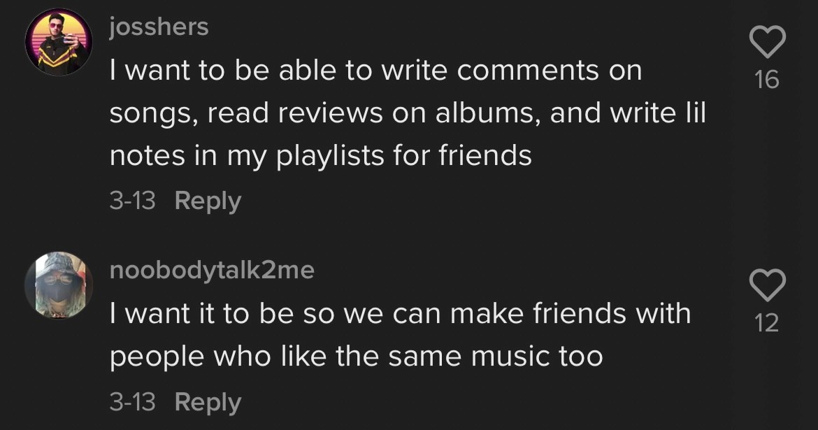
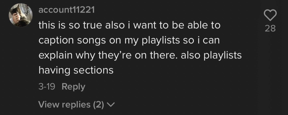
I ran five short interviews with regular streaming listeners aged 20 to 30, about how they listen and what they'd want from anything social on top. Meanwhile a TikTok video about Spotify's missing social features had drawn tens of thousands of likes. Its comments read like a focus group nobody had to recruit, so I treated it as one.
The clearest signal wasn't from the interviews I'd scheduled. It was from strangers already arguing about the same gap in a TikTok comment section.
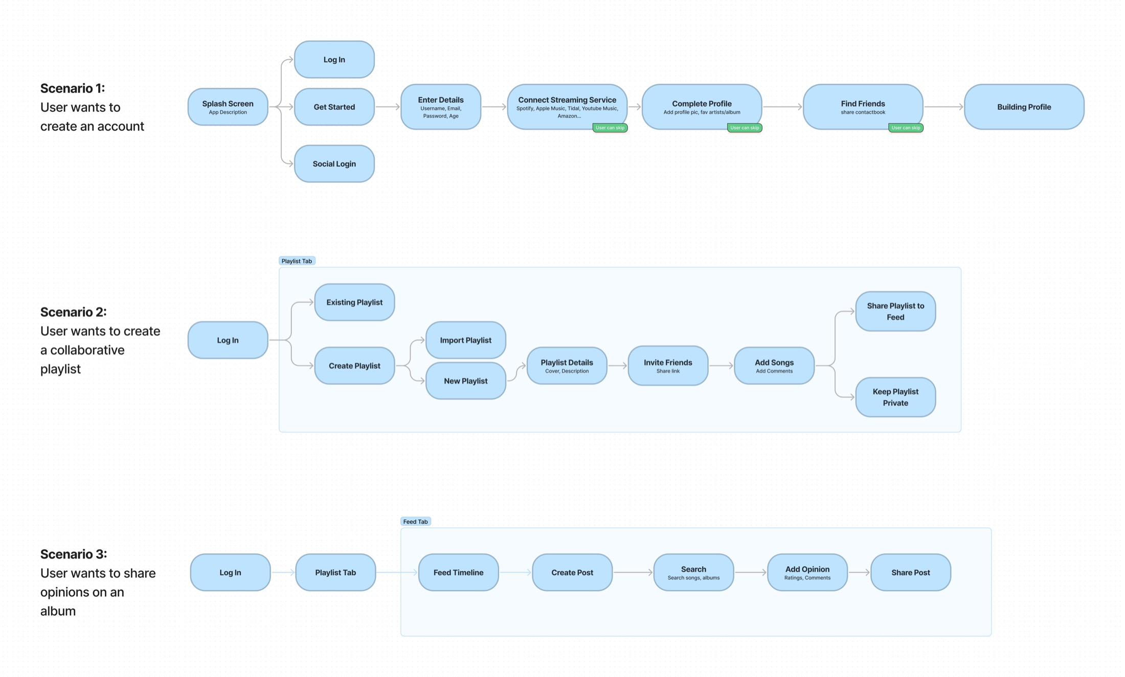
Both went into one affinity map. Three flows came out of it.
- OnboardingCreating an account.
- PlaylistsBuilding a collaborative playlist.
- OpinionsSharing an opinion on an album.
The two sources mostly agreed, and they confirmed the hunch. One reply changed the scope. The top comment wanted social features kept in a separate app, so plain listening stays an escape.
Passed on
Trying to be everything. Amp'd is for the social and collaborative side of music.
03
Testing and design
I tested in grayscale, and the testers gave me two screens I hadn't designed
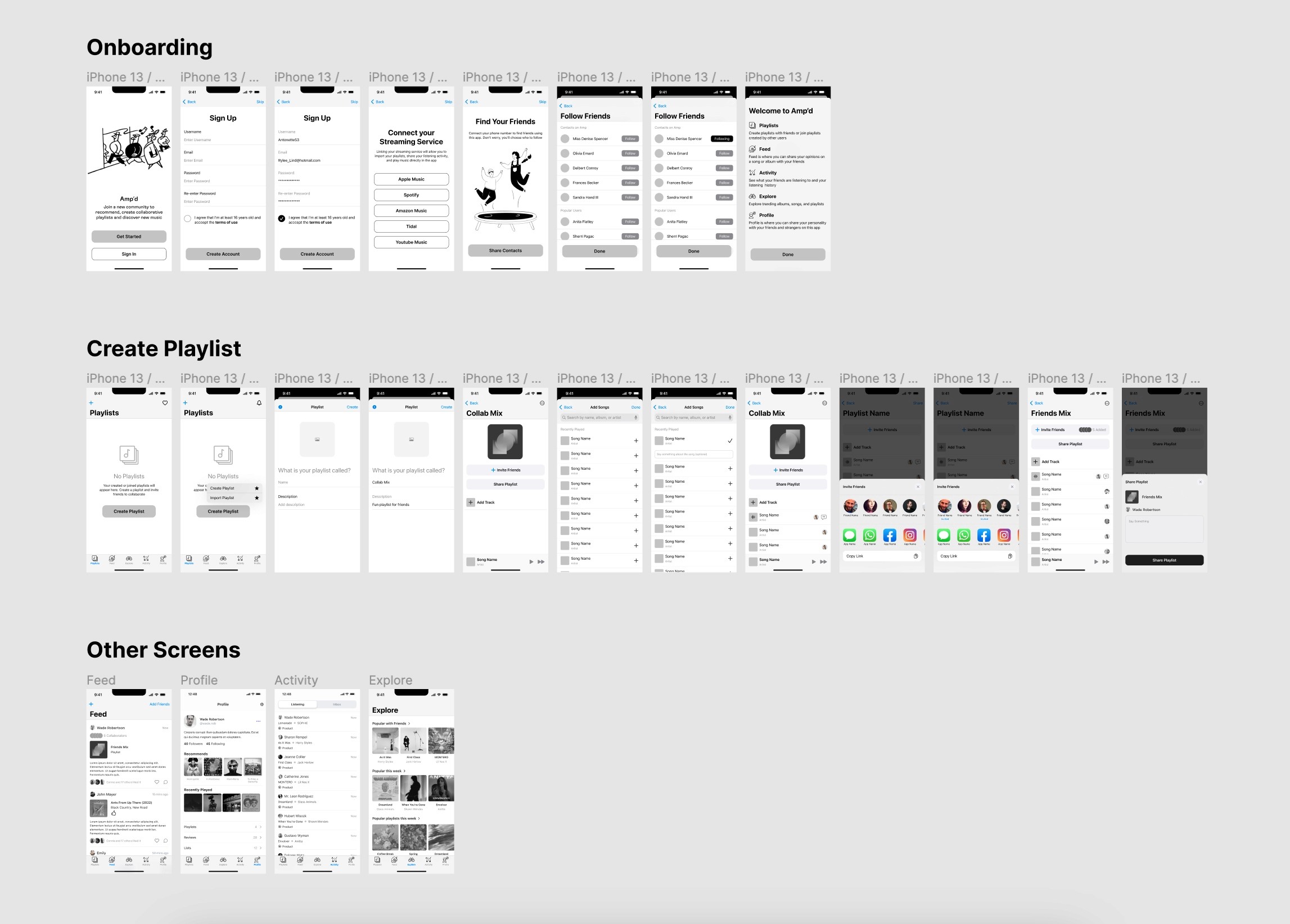
Medium-fidelity wireframes of onboarding, playlist creation and the other core screens went to seven participants as a clickable Maze prototype, before any visual design.
Every tester said they'd use the app, and task ease averaged 4.6 out of 5. The lowest score, 4.4, was for navigating the prototype itself, not the product.
What testing changed
A request for playlist stats (a genre split, a top artist) became the comparison screen. A request for somewhere to react to what a friend had just added to a shared mix became the chat thread on every playlist.
The visual design came after. It follows iOS Human Interface Guidelines for the chrome, with one screen for each thing people asked for: a personalized playlist cover, a note on a song, a review shared to followers, a music-taste profile, and the two from testing.
04
Results
Validated in testing, now in beta
The class ended with a tested prototype. Amp'd has since gone into development and is in TestFlight beta. These numbers are from that first round of testing.
7/7
Testers said they'd use Amp'd
4.6/5
Average ease score across the core tasks
3 mos
From the first interview to a tested, high-fidelity prototype
Takeaway
The best research channel isn't always the one you scheduled
The TikTok thread did as much work as the interviews I'd planned. The comments were unprompted, specific and free. Next time I'd go looking for that kind of conversation at the start, not stumble on it partway through.
Testing the wireframes also surfaced a feature I hadn't thought of, the stats screen, before I'd spent an hour on its visuals. That lesson is cheap before the interface exists and expensive after.
Still open
Seven testers on a prototype is a small sample. The TestFlight beta is the first time people use Amp'd with their own friends and their own music, which is what the whole idea depends on.