Case study · Personal project · iOS app
Turning solo listening into something you do with friends
Streaming apps are built for one person and one pair of headphones. Amp'd adds the social layer underneath — collaborative playlists, reactions, reviews and a feed — designed solo from generative research through a usability-tested prototype.
Problem
Friends already share what they're listening to — just outside the app, over texts and screenshots. Streaming services had nowhere for that to actually live.
Approach
Interviews plus an unrelated TikTok thread mined for the same insight, synthesized into three core flows, then wireframes and a clickable prototype tested with real participants before any visual design.
Outcome
A usability-tested iOS prototype: every participant said they'd use it, with an average ease score of 4.6 out of 5 across the core tasks.
01
The gap
Streaming apps are libraries. Friendships aren't.
Every major music app treats listening as a solo act with a follow button bolted on. There's no shared home for a collaborative playlist, no way to leave a note on the song a friend just added, and no feed of what the people you actually care about are into this week.
For a UX design class project, I set out to design that missing layer — solo, over three months, from the first interview to a usability-tested prototype.
02
Research
Five interviews, and a TikTok thread running the same experiment for free
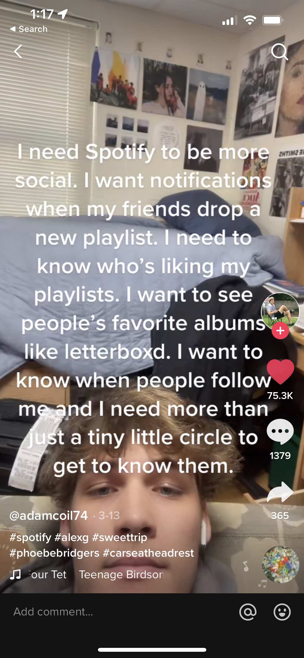
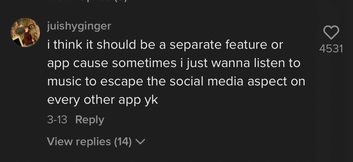
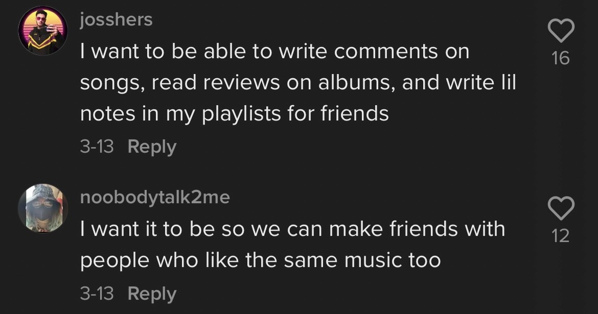
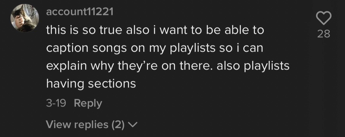
I ran five short 1:1 interviews with regular music-streaming listeners aged 20–30, mapping their listening habits and mental model for anything social layered on top. In parallel, an unrelated TikTok video about Spotify's missing social features had drawn tens of thousands of likes — its comment section read like a focus group nobody had to recruit, so I treated it as one.
The clearest signal wasn't from the interviews I'd scheduled — it was from strangers already arguing about the exact same gap in a TikTok comment section.
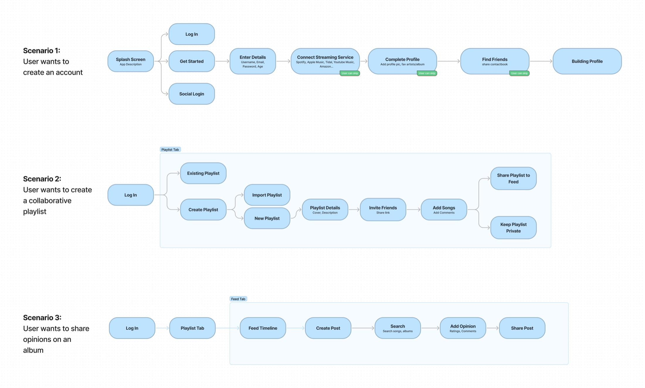
Both sources went into the same affinity map — five interview transcripts and a scroll of unprompted replies — sorted together until three flows worth designing end to end fell out of it: creating an account, building a collaborative playlist, and sharing an opinion on an album.
03
Wireframes
Tested in grayscale before any pixel was final
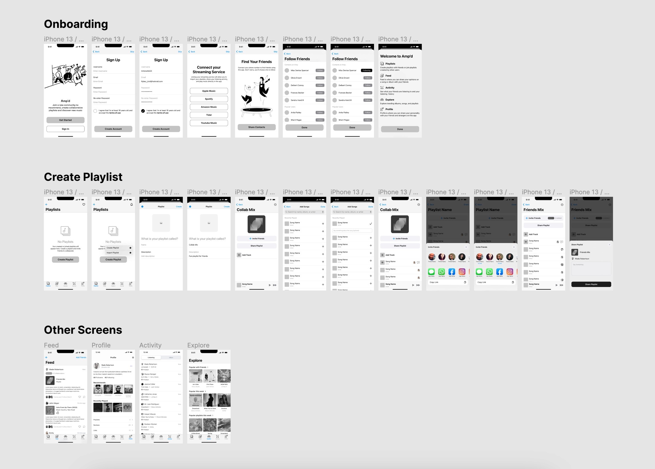
Medium-fidelity wireframes covered onboarding, playlist creation and the app's remaining core screens, then went in front of real participants as a clickable prototype in Maze rather than resting on my own assumptions.
Every tester said they'd use the app, and task ease averaged 4.6 out of 5 — the one near-miss, at 4.4, was navigating the prototype itself, not the product. Open feedback pointed straight at two features I hadn't designed yet: a request for playlist stats — a genre split, a top artist — became the comparison screen; a request for somewhere to react to what a friend had just added to a collab mix became the chat thread on every playlist.
04
Visual design
Six screens, each answering something a tester actually asked for
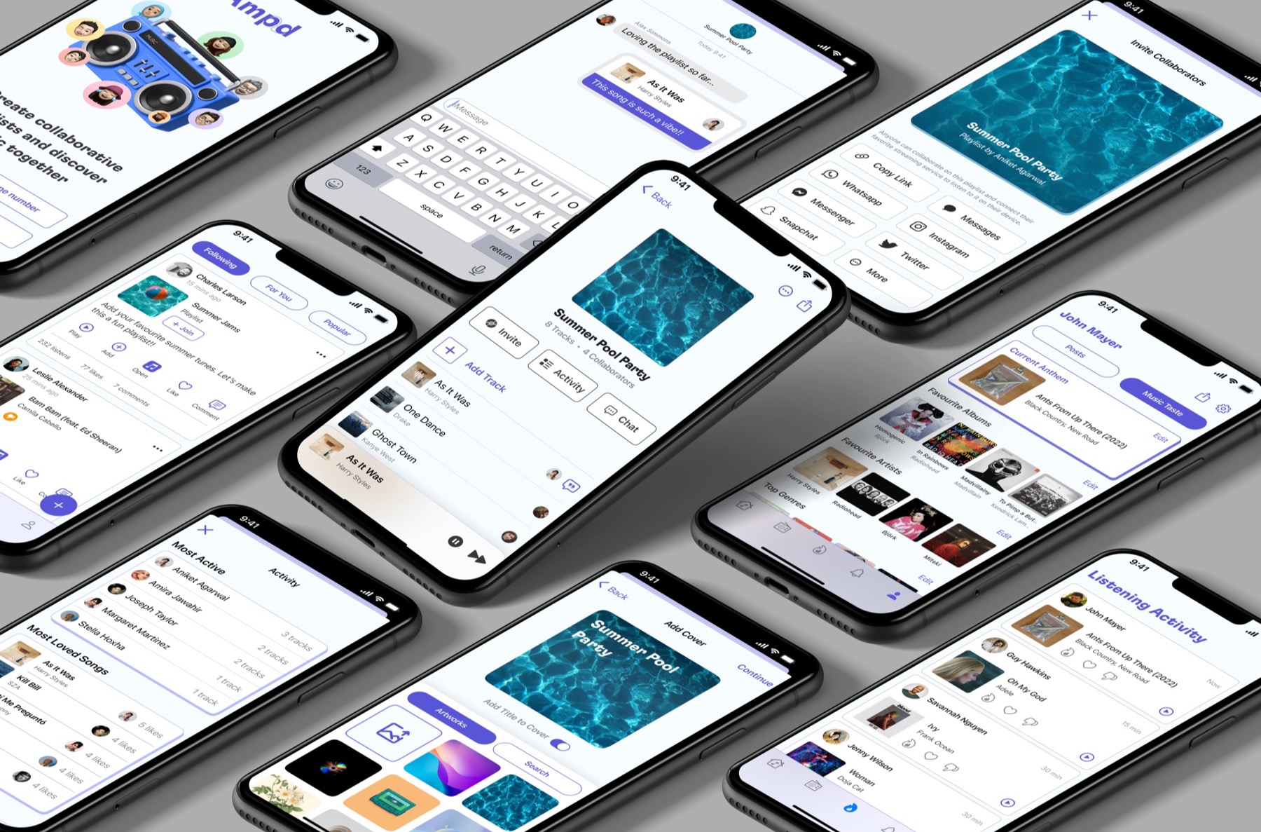
Visual design followed the research rather than the other way around — iOS Human Interface Guidelines for the chrome, then a screen for each thing people said they wanted: a personalized playlist cover, a note left on a song, a review shared to followers, a music-taste profile, and the two screens born directly from testing feedback — comparing activity, and a chat thread on every playlist.
05
Results
Validated as a concept, not yet shipped
Amp'd never went into engineering — the class ended with a usability-tested prototype, not production code. What that testing validated:
7/7
Maze testers said they'd want to use Amp'd
4.6/5
Average ease score across the app's core tasks
3 mos
From the first interview to a usability-tested, high-fidelity prototype
Takeaway
The best research channel isn't always the one you scheduled
The TikTok thread did as much work as the interviews I'd planned — the comments were unprompted, specific and free. I'd go looking for that kind of already-happening conversation earlier next time, instead of treating it as a lucky find partway through.
The part I'd carry forward deliberately: testing the wireframes surfaced a feature I hadn't thought to design — the stats screen — before a single hour went into its visuals. Cheap to learn that lesson before the interface exists; expensive to learn it after.