Case study · Design system · Internship
Creating consistency with a starter design system
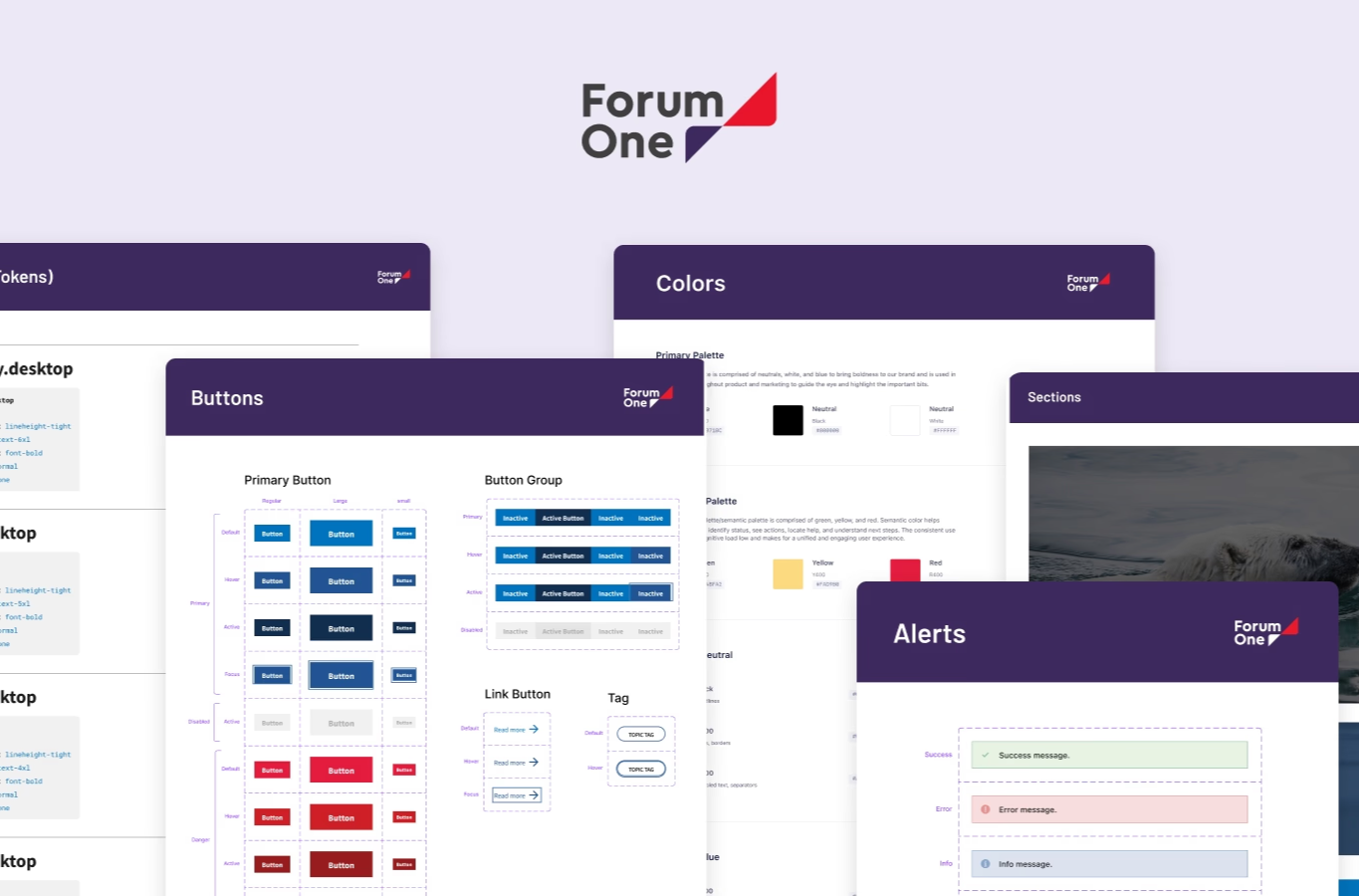
Every new client project meant redrawing the same buttons, colors and type from scratch. I built a starter system in Figma — palette, type scale, components, guidelines — that any designer could duplicate and tailor in a fraction of the time it took to start from nothing.
Problem
No shared system existed, so every project re-coded the same elements from scratch, and the design team drew wireframes a template could have produced in minutes.
Approach
Ran discovery and prioritization workshops with the design and dev teams, then built the system in the order their own votes ranked it — not the order I found interesting.
Outcome
A starter system — style guide, components, guidelines — now duplicated and tailored for every new client project, saving an estimated 10+ hours each time.
01
The gap
The tech team recoded the same button every project
Forum One had no shared design system to build from. Every new engagement meant the tech team rebuilding the same elements and functionality from scratch, and the design team spending its first days on wireframes a template could have produced in minutes.
I was brought on to build that foundation — a style guide, a component library and a set of Figma guidelines duplicated and tailored to a new client instead of redrawn for one.
02
Discovery
A workshop instead of assuming I already knew the pain points
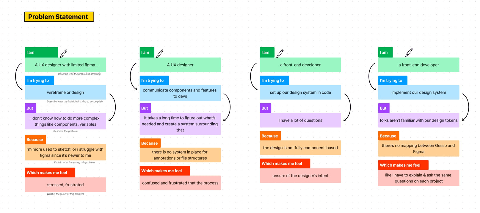
Rather than guess what a starter system needed to solve, I ran a workshop with the team's designers and developers — mapping what each of them was trying to do, what got in the way, and why it left them frustrated.
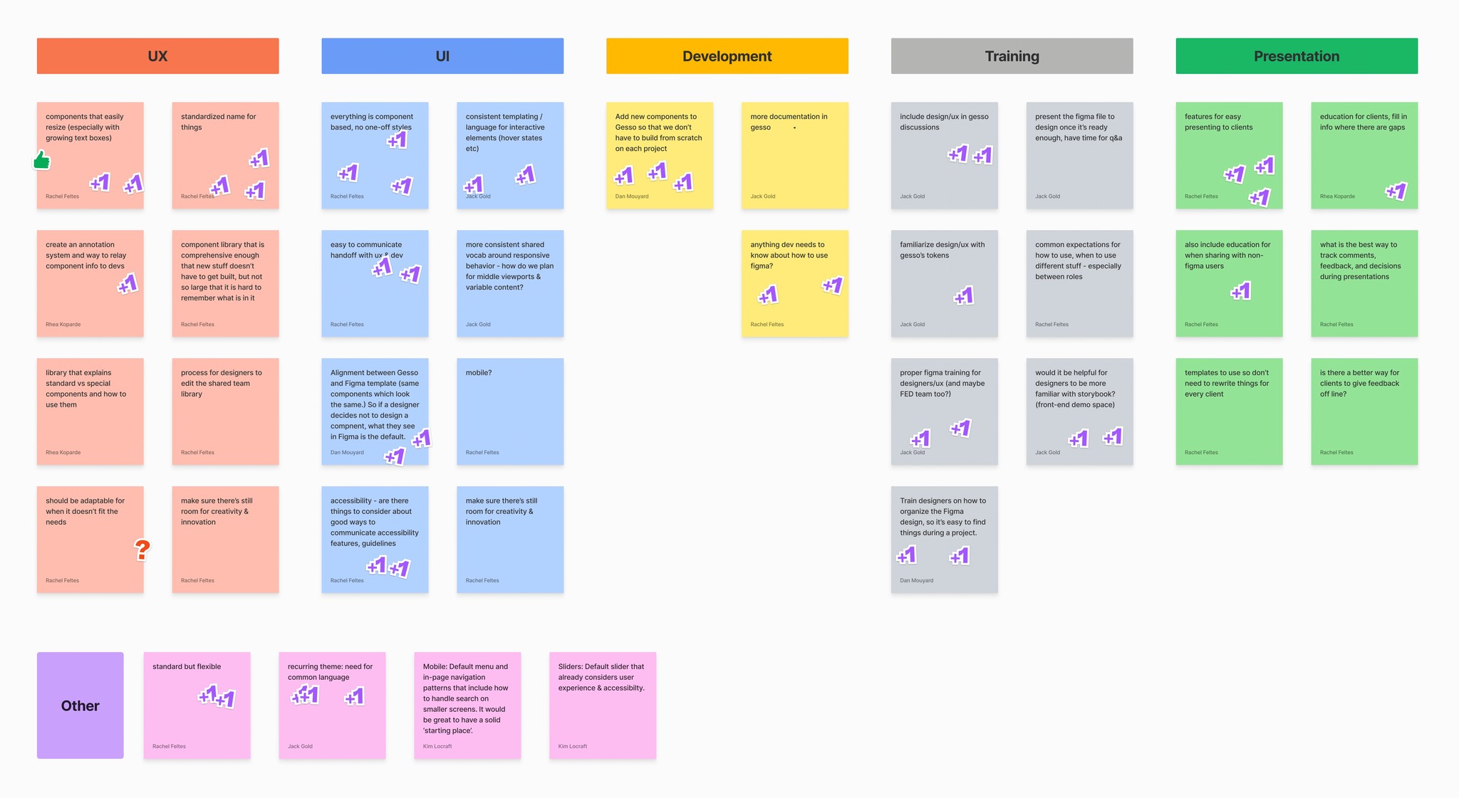
A second, open brainstorm surfaced everyone's ideas for the system itself. Priorities came from a vote, not from me — so the system got built in the order that mattered to the people who'd use it.
03
Implementation
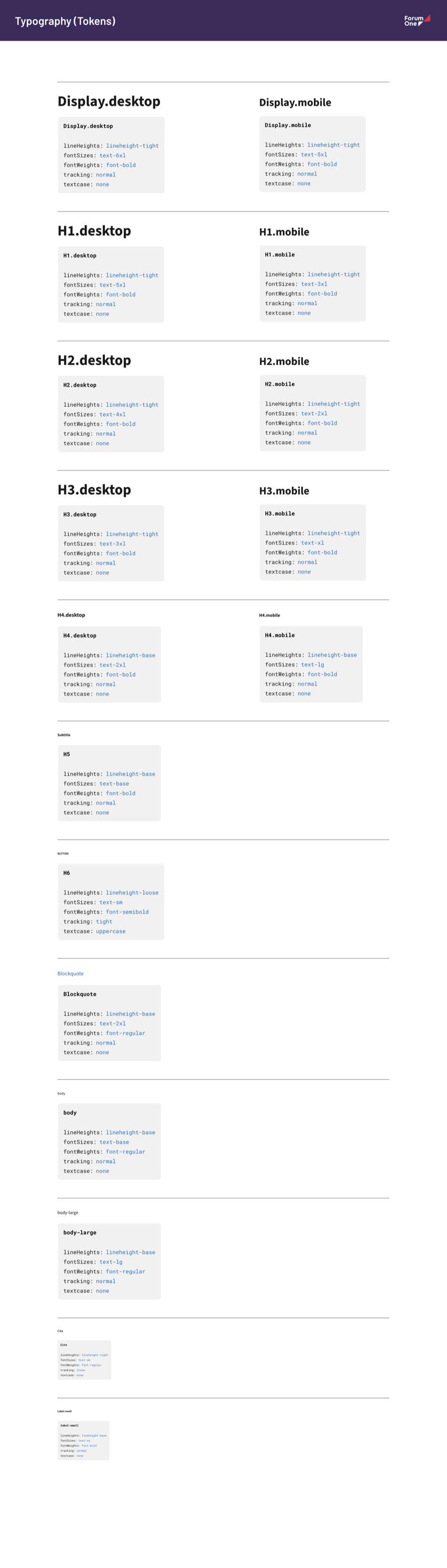
Type could be 85% of any screen, so it came first
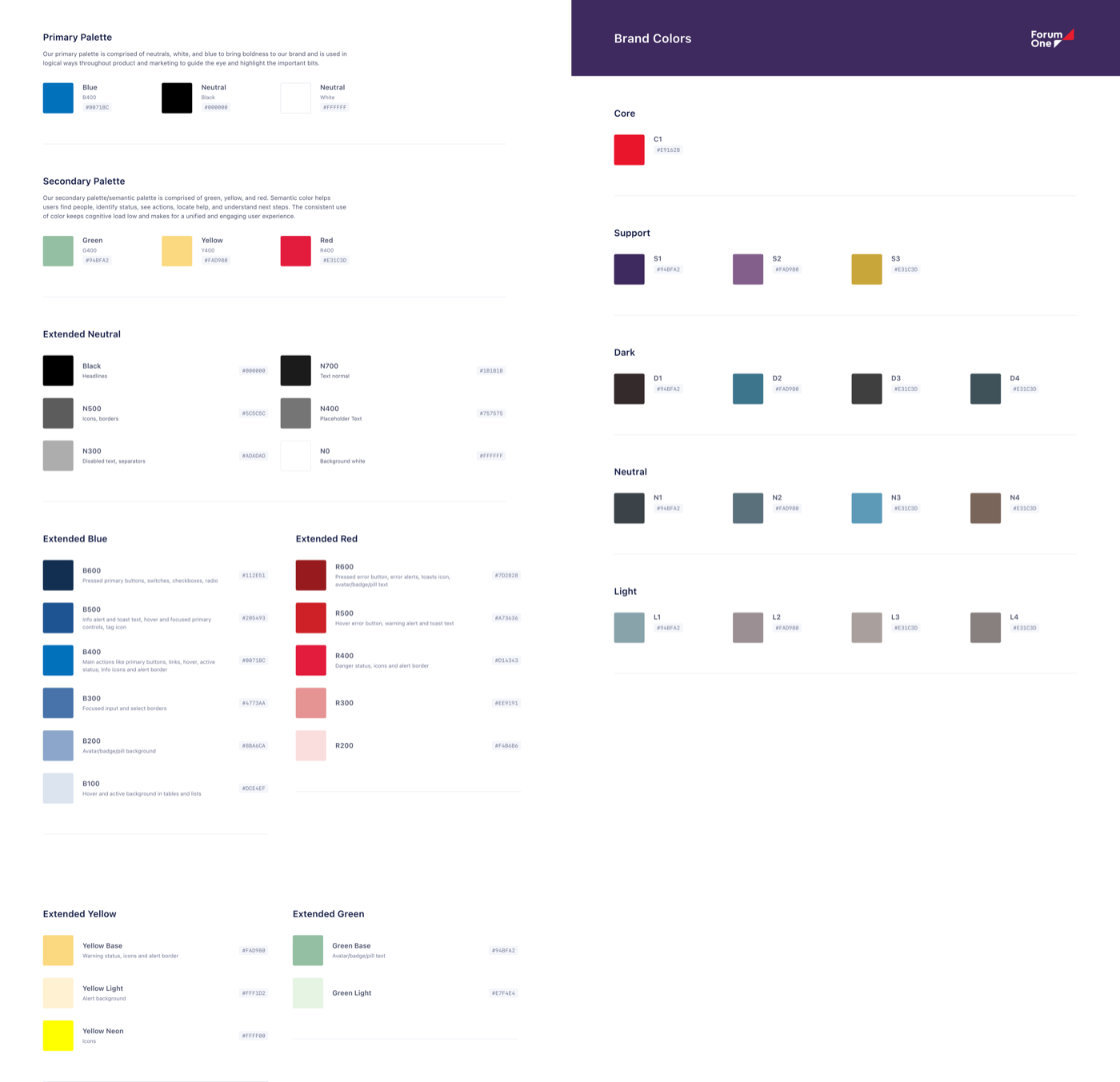
After surveying dozens of other organizations' systems, I gathered the components and patterns Forum One's own projects reused most — starting with the two decisions that touch every other one: color and type.
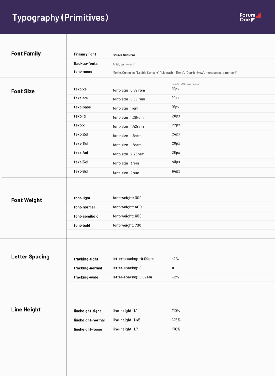
The color guide stays minimal on purpose: a primary palette plus semantic colors for status and alerts, each with its own extended scale rather than a single fixed hex. Typography followed the same logic — a token set for size, weight, tracking and line height that's accessible and responsive by default, not tuned per project.
04
Component library
One library, built for WordPress and Drupal both
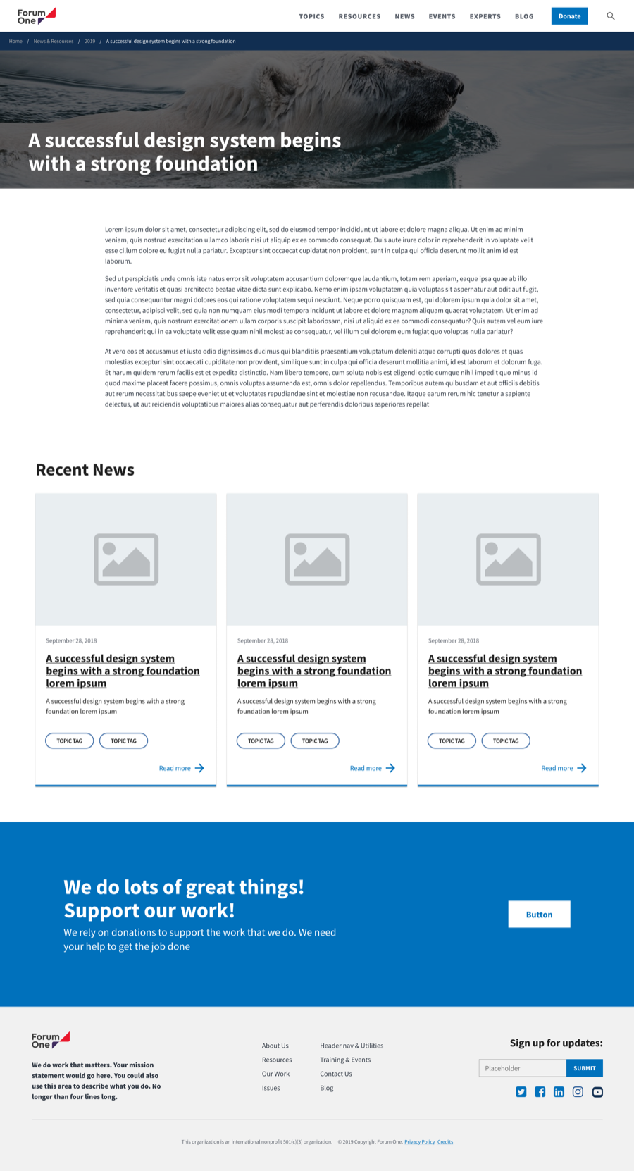
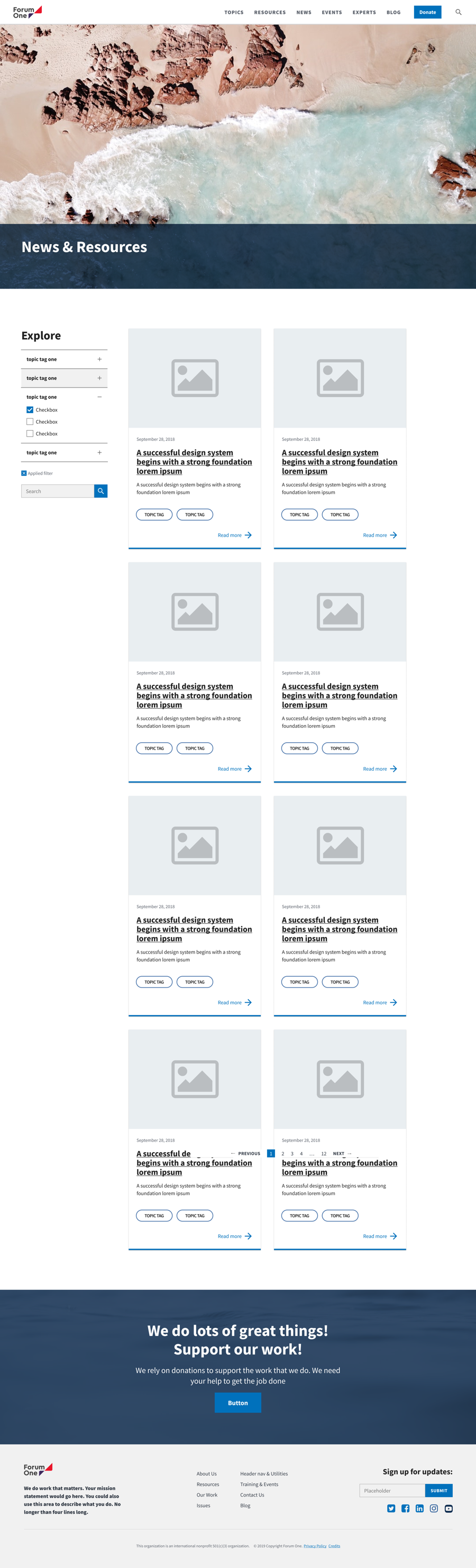
From color and type I built the actual component library — forms, buttons, alerts, navigation — supported by both of Forum One's build platforms, so nothing in it needed to be recreated per project.
Every state — default, hover, active, disabled, error — shipped with the component, not added later by whoever happened to build the screen.
Scroll ↔

05
Results
A system the team is still building from
The starter system shipped as the foundation for new client work — not a one-off deliverable that sat unused after the internship ended.
10+ hrs
Saved per project, once teams stopped rebuilding the same elements from scratch
2 mos
From kickoff workshop to a shipped, documented starter system
Adopted
Still the foundation designers duplicate and tailor for new client projects
Takeaway
Design systems are living documents, not deliverables
The hardest part wasn't the components — it was getting a cross-functional team to agree on priorities before I started building. The vote did that job better than my own judgment would have.
The part I'd carry into the next project: workshop first, build second. A system that reflects the team's own prioritization gets adopted; one that reflects only the designer's taste doesn't.