- Role
- Lead UX and UI designer, Onething Design
- Team
- Me, a second UX designer, a product manager and a front-end developer
- Timeline
- 6 months, 2019–2020
- Status
- Launched
- Focus
- Discovery, user research, design, animation, user testing
Overview
YOUnique is RBL Bank's credit card with rewards you choose. You pick the ones you want, add as many as you like, and pay only for those. We designed how you build one online, at Onething Design. I led the research and the design.
Case study · Client work · Banking
Creating India's first credit card with customizable rewards
A credit card usually comes with a fixed set of offers, wanted or not. YOUnique lets you build your own: no unwanted offers and no hidden fees. Picking rewards one by one was new for a credit card, so the work was making it feel familiar.
The question
Nobody had picked a credit card's rewards one by one before. How do you make building one feel familiar, open about what it costs, and easy to finish?
My part
I led the research and design: discovery, user research, the flow, the screens, the animation and the user testing. I worked with a second UX designer, a product manager and a front-end developer.
Outcome
The card launched as India's first with customizable rewards, and was one of RBL Bank's five best-selling credit cards in 2020–21.
01
The brief
Choosing rewards had to feel like shopping, not paperwork
RBL Bank came to us with the card's idea: the customer decides what's on it. Our job was the online journey, from finding out you're eligible to ordering the card. We set ourselves four problems to solve.
- OpenMake buying a card interactive and transparent.
- EngagingKeep people engaged while they pick rewards.
- IntuitiveLet anyone build the card they want without help.
- FamiliarMake picking rewards feel like something they've done before.
02
Research
I studied what people already build for themselves
There was no credit card like it to learn from, so I looked at products people already customize: laptops from Apple and Dell, car configurators like BMW's, and shopping carts like Amazon's. Four things came out of it.
- Building is funPeople enjoy customizing something interactively.
- Too much is too muchToo many choices at once overwhelm them.
- No pushingThey like to browse offers without being pushed to one.
- FiltersThey like narrowing a long list down with filters.
03
First direction
Four kinds of rewards asked too much of someone getting a card
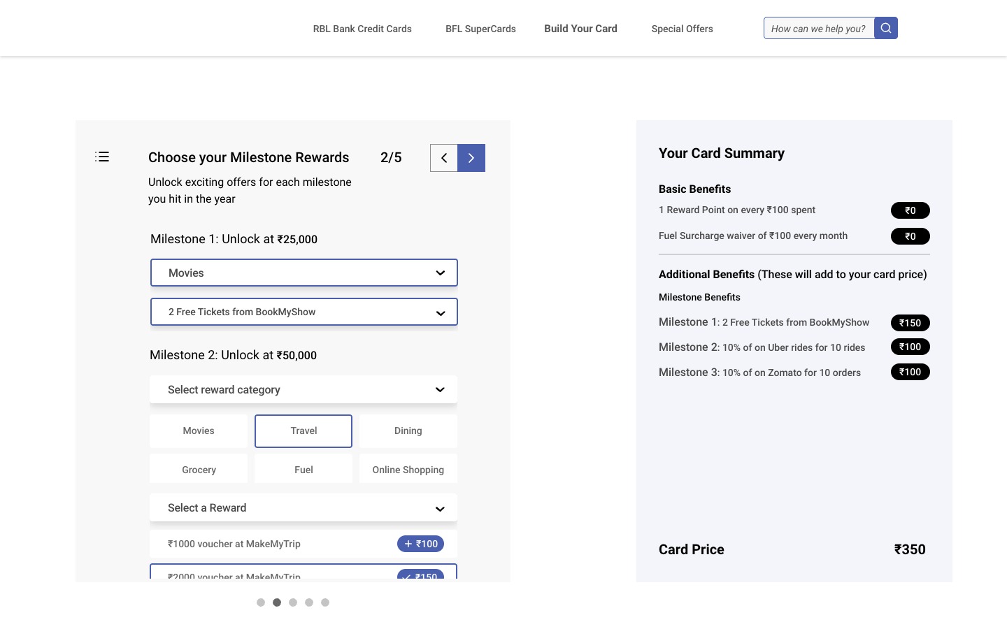
The first direction had four kinds of reward, chosen one after another. First your free rewards. Then milestone rewards, which unlock once you've spent a set amount in a year. Then partner rewards, from other companies with their own offers. Then accelerated rewards: 4x points per ₹100 spent in a category you pick.
Each kind worked differently, so every step had to be learned before you could choose. It took more thought than most people want to give to getting a new credit card.
Decided against
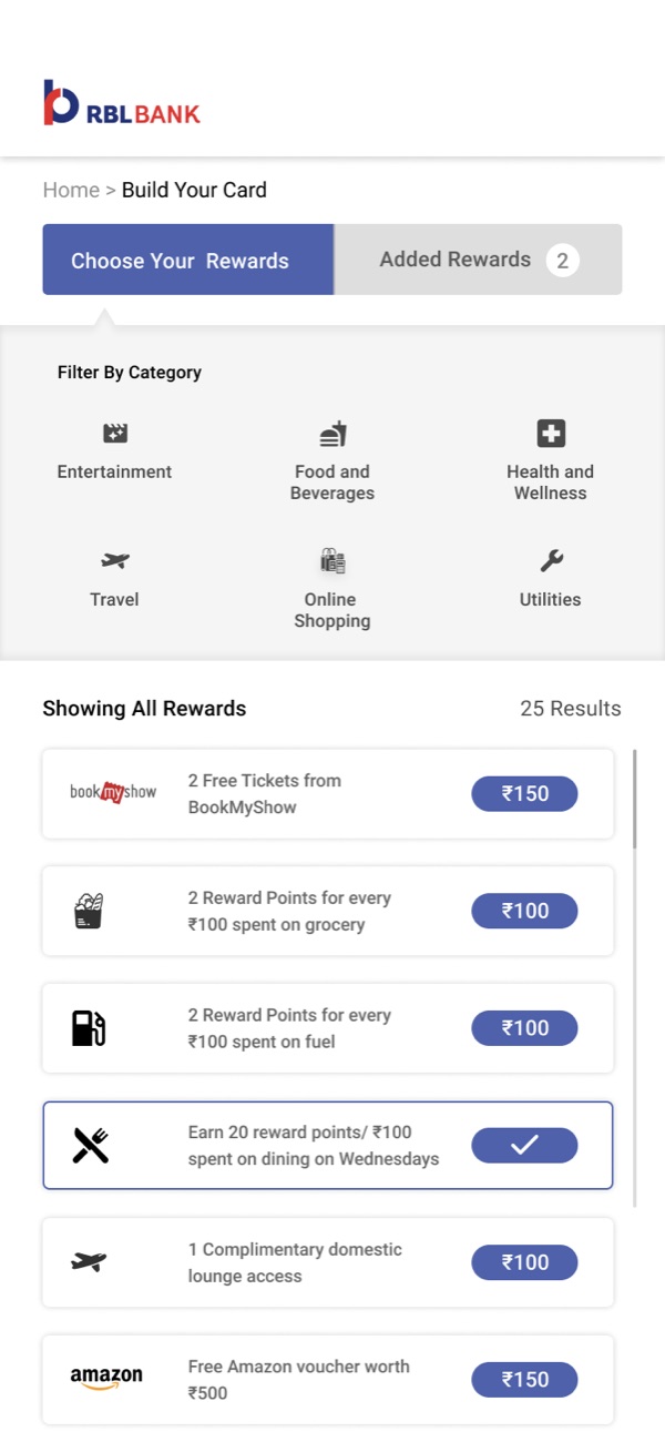
So many kinds of reward. After user testing we dropped them for one catalogue you browse and filter like a shop, with the card as the cart and the fee adding up as you go.
Trade-off
Time, and some of the research. RBL's team went back and forth on the direction, and we followed it down paths that went nowhere before a final one was agreed.
04
The flow
Eligibility first, then rewards, then how the card looks
The journey starts with a few basic details. A returning visitor picks up where they left off. Everyone else fills in the eligibility form and hears straight away whether they're approved. Only then do they choose rewards, check what they've added, pick the card's colour, and review the card and their savings before ordering.

05
Testing
Testers wanted the card, but couldn't picture the rewards
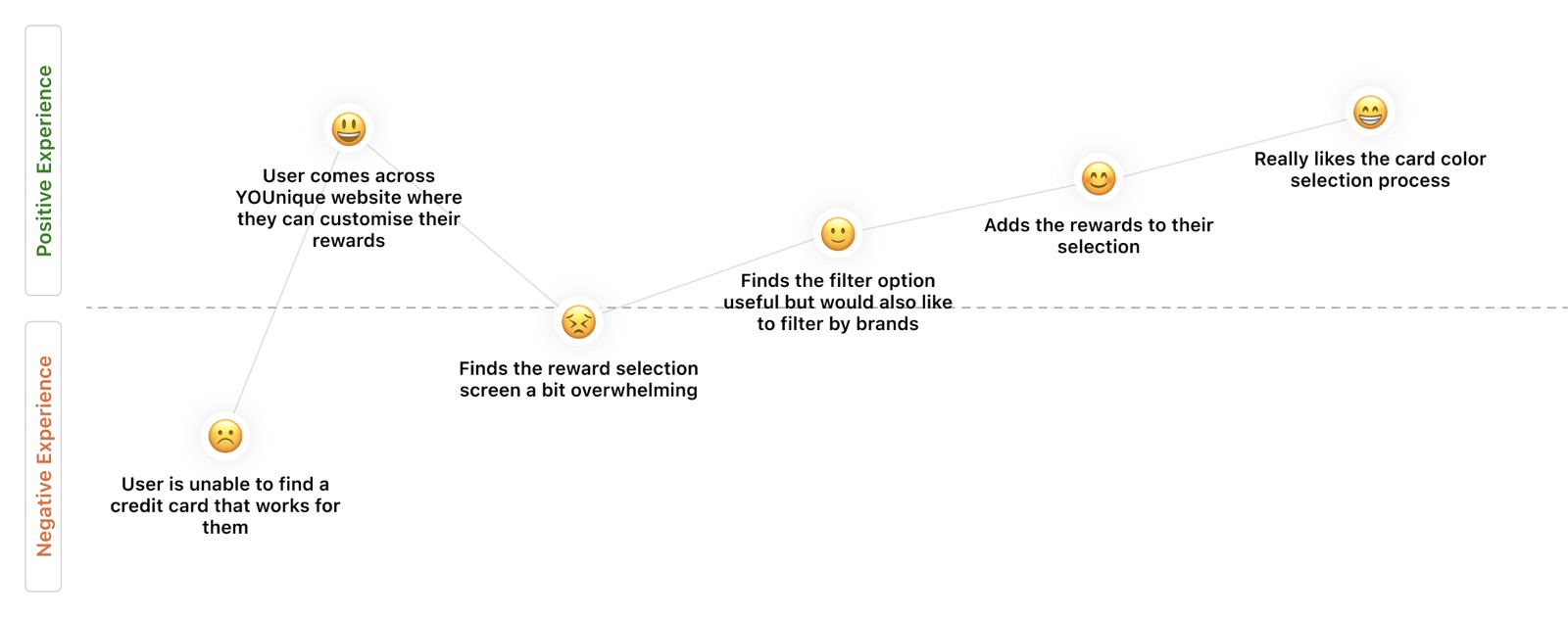
Ten people tried a medium-fidelity prototype. Asked whether they'd buy a credit card that lets you customize your rewards, nine said yes, absolutely. The tenth would, with help from a sales person.
The idea wasn't the problem. Choosing was. The reward screen was the low point of the journey: people found it overwhelming. Filtering by category helped, but they wanted to filter by brand too.
“I'm having a hard time discovering and visualizing the rewards I want.”
What testing changed
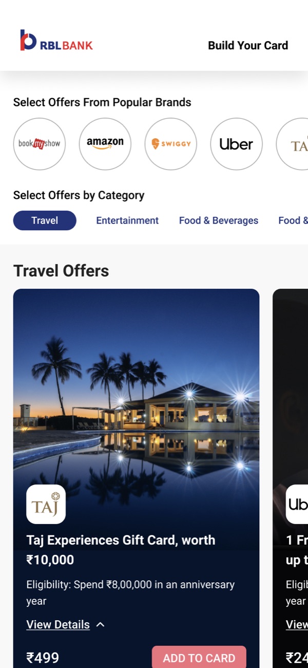
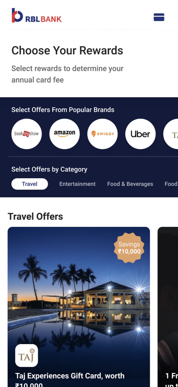
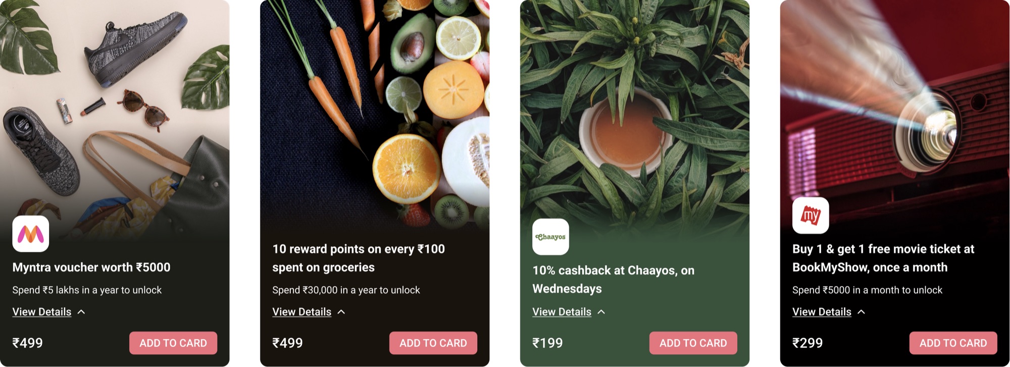
The reward screen. A row of popular brands now sits above the categories, and each offer is a large picture card with the brand, the reward and what you have to spend to unlock it, in place of a line in a text list.
06
Final design
The fee is just the rewards you added
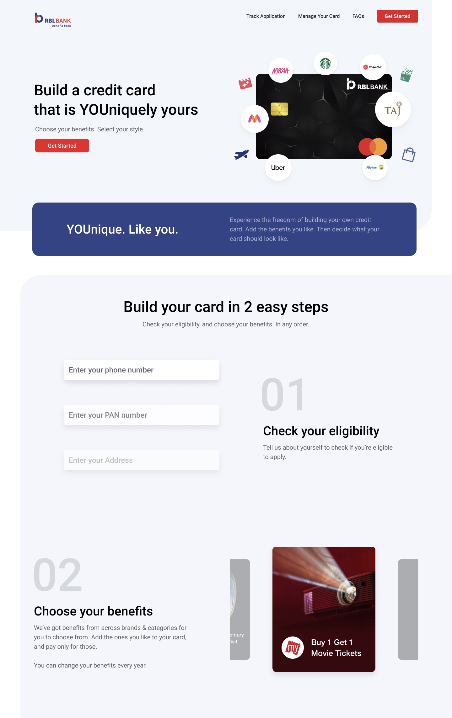
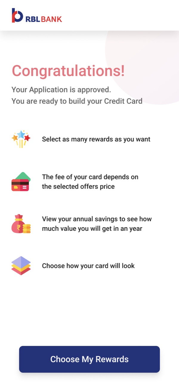
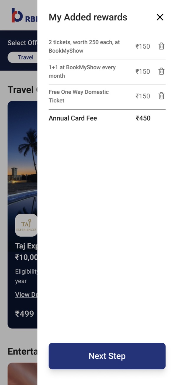
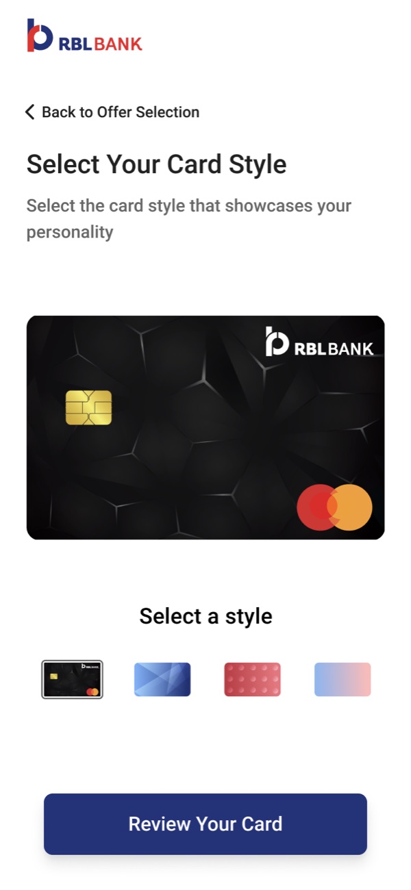
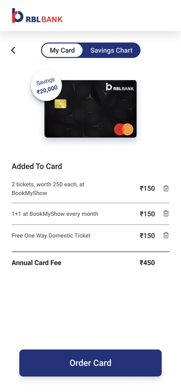
The landing page sells the idea in two steps: check your eligibility, then choose your benefits. Once approved, you browse offers by brand or category and add them to the card. Your added rewards are listed with their prices, then you choose the card's look.
The review screen puts it all together: the card, each reward and what it costs, and an annual fee that is simply their sum. A second tab charts what you'd save.
07
Results
A first for Indian credit cards, and a best-seller
YOUnique launched as the first credit card in India with rewards you choose, and became one of RBL Bank's top five best-selling credit cards in 2020–21.
1st
Credit card in India with customizable rewards
Top 5
Among RBL Bank's best-selling credit cards, 2020–21
9/10
Testers said they'd buy a card with rewards they choose
Takeaway
Testing doesn't end when development starts
One round with ten people reshaped the reward screen, the heart of the product. I'd test earlier and more often, design for mobile first, and keep testing after the card is built.